
Farasha - Re-branding for Existing Brand
Farasha - Re-branding for Existing Brand
Timeline
Feb - Mar 2024
Rules
Product Designer
Skills
Mockup
Critical Thinking
Concepting
Tools
Figma
Illustrator
Photoshop
Procreate
Overview
The project aimed to redesign a current business or retail outlet and establish a promotional approach. I got to redesign the brand identity for HandmadebyRachi which is a jewelry business that belongs to Rachi. My teammate and I discussed the shop’s core values and creative process along with its branding elements to create a design that reflected its identity accurately. We demonstrated the new logo at the project's conclusion and detailed the thought process behind our design decisions.
What I Learn
This project taught me effective collaboration methods in branding and design to synchronize visual components like logos and color schemes with a business's core values and target audience. Through target audience research combined with deep analysis of the shop's values I discovered how crucial it was to maintain essential brand components during the identity refinement process. Working on this project taught me how to comprehend user requirements while improving marketing tactics such as social media advertising and designing unified visual identities that connect with customers.
Timeline
Timeline
Feb - Mar 2024
Feb - Mar 2024
Rules
Rules
Product Designer
Product Designer
Skills
Skills
Mockup
Critical Thinking
Concepting
Mockup
Critical Thinking
Concepting
Tools
Tools
Figma
Illustrator
Photoshop
Procreate
Figma
Illustrator
Photoshop
Procreate
Overview
Overview
The project aimed to redesign a current business or retail outlet and establish a promotional approach. I got to redesign the brand identity for HandmadebyRachi which is a jewelry business that belongs to Rachi. My teammate and I discussed the shop’s core values and creative process along with its branding elements to create a design that reflected its identity accurately. We demonstrated the new logo at the project's conclusion and detailed the thought process behind our design decisions.
The project aimed to redesign a current business or retail outlet and establish a promotional approach. I got to redesign the brand identity for HandmadebyRachi which is a jewelry business that belongs to Rachi. My teammate and I discussed the shop’s core values and creative process along with its branding elements to create a design that reflected its identity accurately. We demonstrated the new logo at the project's conclusion and detailed the thought process behind our design decisions.
What I Learn
What I Learn
This project taught me effective collaboration methods in branding and design to synchronize visual components like logos and color schemes with a business's core values and target audience. Through target audience research combined with deep analysis of the shop's values I discovered how crucial it was to maintain essential brand components during the identity refinement process. Working on this project taught me how to comprehend user requirements while improving marketing tactics such as social media advertising and designing unified visual identities that connect with customers.
This project taught me effective collaboration methods in branding and design to synchronize visual components like logos and color schemes with a business's core values and target audience. Through target audience research combined with deep analysis of the shop's values I discovered how crucial it was to maintain essential brand components during the identity refinement process. Working on this project taught me how to comprehend user requirements while improving marketing tactics such as social media advertising and designing unified visual identities that connect with customers.
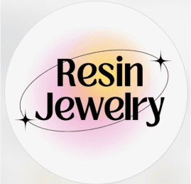
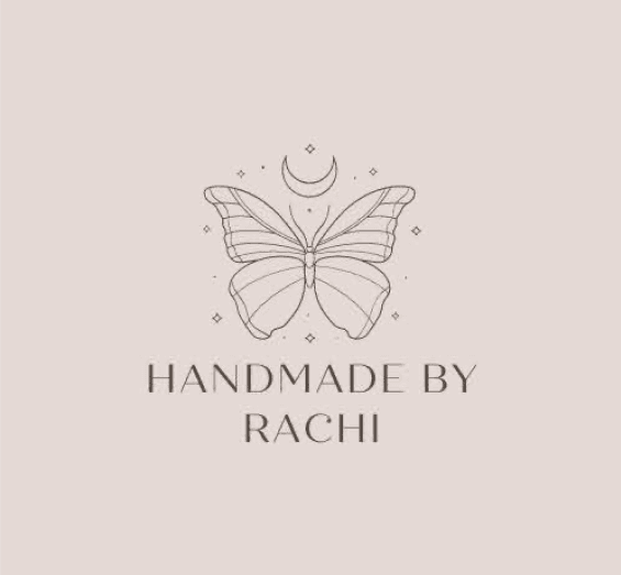
What is the original name of Farasha brand?
Handmadebyrachi is a boutique jewelry brand specializing in handcrafted necklaces, bracelets, earrings, and rings. Established in 2020 in Dubai as an online venture, it has since blossomed into a global presence, with operations extending to India and Canada. Beyond the digital realm, Handmadebyrachi also graces in-person market stalls, bringing its artisanal creations closer to jewelry enthusiasts worldwide.
Researh
Competitor Analysis
Researh
Competitor Analysis
Researh
Competitor Analysis
Brand Identity
Brand Identity
Identity
Analyzing Handmadebyrachi's look
Dubai
Language: Uses gen-z terminology, very simple and straightforward
Colour: Uses aura colours and ombre effect
Common Traits: use sparkles in logo and warm colours
Dubai
Language: Uses gen-z terminology, very simple and straightforward
Colour: Uses aura colours and ombre effect
Common Traits: use sparkles in logo and warm colours
Dubai & Canada
Language: Uses gen-z terminology and marketing, as well as business formal
Colour: brown, beige tones & dusty pink
Common traits: use sparkles in logo and warm colours
Dubai & Canada
Language: Uses gen-z terminology and marketing, as well as business formal
Colour: brown, beige tones & dusty pink
Common traits: use sparkles in logo and warm colours

Miflight™
Language: Uses business formal and mellenial terminology
Colour: shades of pink and white
Common traits: use sparkles in logo and warm colours
Miflight™
Language: Uses business formal and mellenial terminology
Colour: shades of pink and white
Common traits: use sparkles in logo and warm colours
Dubai
Language: Uses gen-z terminology, very simple and straightforward
Colour: Uses aura colours and ombre effect
Common Traits: use sparkles in logo and warm colours
Dubai & Canada
Language: Uses gen-z terminology and marketing, as well as business formal
Colour: brown, beige tones & dusty pink
Common traits: use sparkles in logo and warm colours
Canada
Language: Uses business formal and mellenial terminology
Colour: shades of pink and white
Common traits: use sparkles in logo and warm colours
Identity
Analyzing Handmadebyrachi's look
As the business leverages Instagram and TikTok as primary marketing platforms, its target audience primarily encompasses individuals aged 13 to 25 years old. However, given TikTok's recent expansion into older demographics, there's an opportunity to extend the business's marketing efforts towards this demographic as well.
As the business leverages Instagram and TikTok as primary marketing platforms, its target audience primarily encompasses individuals aged 13 to 25 years old. However, given TikTok's recent expansion into older demographics, there's an opportunity to extend the business's marketing efforts towards this demographic as well.
Identity
Analyzing Handmadebyrachi's look
As the business leverages Instagram and TikTok as primary marketing platforms, its target audience primarily encompasses individuals aged 13 to 25 years old. However, given TikTok's recent expansion into older demographics, there's an opportunity to extend the business's marketing efforts towards this demographic as well.
Business Style
Although the original design conveys elegance through the butterfly and font, its professionalism is undermined by inconsistencies in the color scheme.
Business Style
Although the original design conveys elegance through the butterfly and font, its professionalism is undermined by inconsistencies in the color scheme.
Product Image
The brand's elegant visual identity appeals to millennials but lacks alignment with Gen Z's preference for street-style, grunge, or softer visuals, reducing its appeal.
Product Image
The brand's elegant visual identity appeals to millennials but lacks alignment with Gen Z's preference for street-style, grunge, or softer visuals, reducing its appeal.
Message
The brand's visual representation lacks consistency, however its messaging is effectively conveyed through its language.
Message
The brand's visual representation lacks consistency, however its messaging is effectively conveyed through its language.
Although the original design conveys elegance through the butterfly and font, its professionalism is undermined by inconsistencies in the color scheme.
Business Style
Although the original design conveys elegance through the butterfly and font, its professionalism is undermined by inconsistencies in the color scheme.
Business Style
The brand's elegant visual identity appeals to millennials but lacks alignment with Gen Z's preference for street-style, grunge, or softer visuals, reducing its appeal.
Product Image
The brand's elegant visual identity appeals to millennials but lacks alignment with Gen Z's preference for street-style, grunge, or softer visuals, reducing its appeal.
Product Image
The brand's visual representation lacks consistency, however its messaging is effectively conveyed through its language.
Message
The brand's visual representation lacks consistency, however its messaging is effectively conveyed through its language.
Message
Although the original design conveys elegance through the butterfly and font, its professionalism is undermined by inconsistencies in the color scheme.
Business Style
The brand's elegant visual identity appeals to millennials but lacks alignment with Gen Z's preference for street-style, grunge, or softer visuals, reducing its appeal.
Product Image
The brand's visual representation lacks consistency, however its messaging is effectively conveyed through its language.
Message
Design
Brand Identity
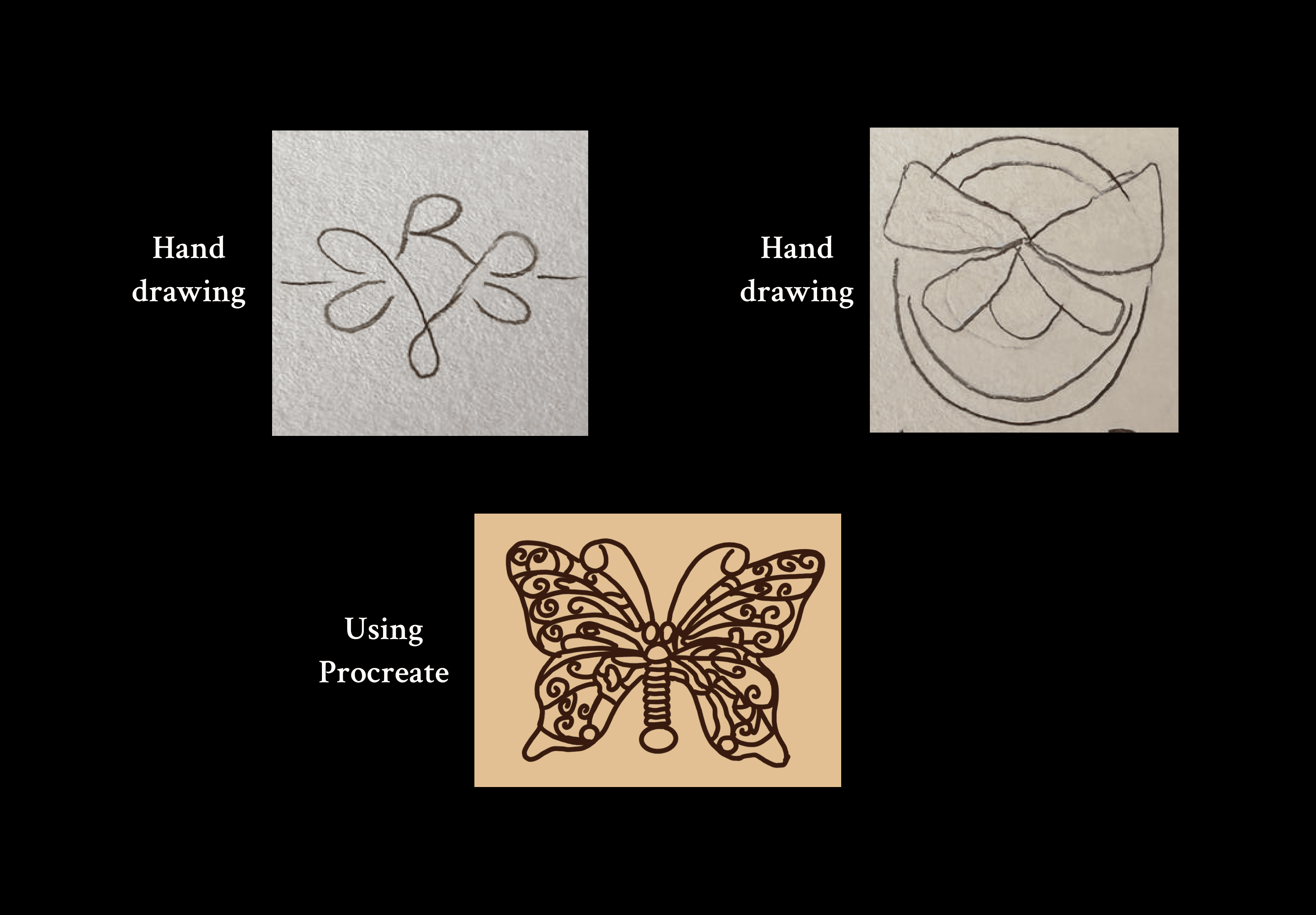
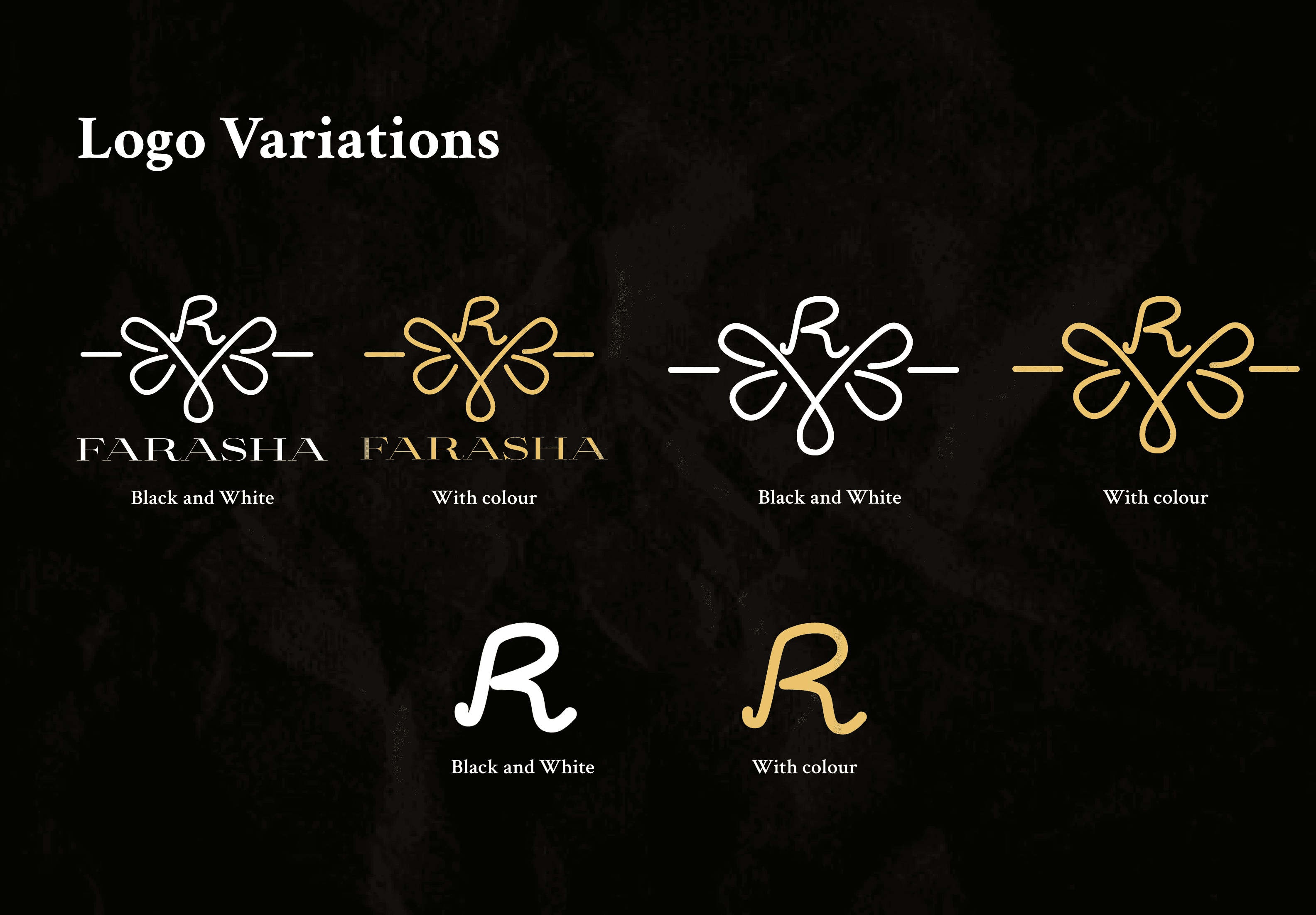
Name Decision
Our final choice was Farasha 💎 Originating in Dubai, the name means "butterfly" in Arabic, symbolizing freedom and transformation, reflecting the shop owner's vision. It has a feminine charm that is graceful yet not overly delicate, striking a balance between beauty and sophistication.
Brand Slogan
" Unleash Your Style "
Our target audiences that you can be any style or aesthetic you want by customising your jewellery to your taste. Now it's your turn to choose.
Design
Brand Identity
Name Decision
Our final choice was Farasha 💎 Originating in Dubai, the name means "butterfly" in Arabic, symbolizing freedom and transformation, reflecting the shop owner's vision. It has a feminine charm that is graceful yet not overly delicate, striking a balance between beauty and sophistication.
Brand Slogan
" Unleash Your Style "
Our target audiences that you can be any style or aesthetic you want by customising your jewellery to your taste. Now it's your turn to choose.
Brand Information
Colour Decision
The color palette of gold, white, and black was chosen to reflect elegance and sophistication. Gold symbolizes luxury and quality, white conveys simplicity and purity.
Typography
To show the elegant style in the jewelry shop, we think that using a thin but sharp style - Aviano Didone will convey the desired sense of elegance and exclusivity.
Brand Information
Brand Information
Colour Decision
The color palette of gold, white, and black was chosen to reflect elegance and sophistication. Gold symbolizes luxury and quality, white conveys simplicity and purity.
Typography
To show the elegant style in the jewelry shop, we think that using a thin but sharp style - Aviano Didone will convey the desired sense of elegance and exclusivity.
Case Studies
Case Studies
Case Studies

Airnav
Mockup for Airport app in Toronto Pearson
Airnav
Mockup for Airport app in Toronto Pearson
Airnav
Mockup for Airport app in Toronto Pearson
Airnav
Re-branding for existing brand