

AIRNAV - Mockup for Airport app in Toronto Pearson
Timeline
Jan - May 2024
Rules
UX/UI Designer
UX Researcher
Skills
Interaction Design
Prototyping
Wireframe
Concepting
Visual Design
Tools
Figma
Miro
Overview
Every day, people travel from Toronto to destinations worldwide. Travelers both frequent and occasional remain unaware that Toronto Pearson Airport does not offer an advanced application to monitor flight schedules and airport services as well as other facilities. The project provides a chance to build AIRNAV which is an airport status application designed to enhance the travel experience.
This case study offers a thorough examination of the design process beginning with pain point identification and leading through solution development and comparative analysis while explaining decisions made at each stage.
What I Learn
🕶 Through user-centered design principles the team analyzed competitor apps and created a persona-based strategy that improved airport navigation for seamless user interactions.
🕶 The scalable logo design and intuitive user interface were crafted to merge aesthetic appeal with functional usability to boost user interaction.
💼 The team measured the app's effectiveness through established KPIs which included real-time accuracy and user engagement metrics.
💼 Tech Integration involved the exploration of AR-powered navigation systems along with AI-driven assistants to improve travel experience efficiency and quality.
What is this app?
🚀 "Airnav" is a combination of "Air" (aviation) and "Nav" (navigation), aims to be an user-focused travel companion, blending innovative design with functionality to cater to the diverse needs of frequent and occasional travelers. Centered on creating intuitive and efficient interactions, the app enhances the travel experience by providing real-time access to essential flight data and airport amenities in Toronto.
Researh
Identifying Problem
According to a Cisco AppDynamics survey (May 2022), 74% of travelers view apps and digital solutions as vital to their vacation experiences. Post-pandemic, travel app adoption surged, with summer 2022 downloads exceeding pre-pandemic peaks, as reported by data.ai.
However, many airports have discontinued their apps due to limited usage (failure to provide accurate updates and essential features), despite efforts to enhance passenger experiences through digital touchpoints. These apps largely failed to engage travelers effectively.
What is the solution?
Real-Time Accuracy
Provide reliable, real-time updates on flight statuses, gate changes, and delays to build trust with users
Real-Time Accuracy
Provide reliable, real-time updates on flight statuses, gate changes, and delays to build trust with users
Enhanced User Experience
Design a clean, intuitive interface for quick access to essential features like maps, boarding info, and check-ins.
Enhanced User Experience
Design a clean, intuitive interface for quick access to essential features like maps, boarding info, and check-ins.
Comprehensive Features
Integrate functionalities like security wait times, baggage tracking, parking options, and lounge information.
Comprehensive Features
Integrate functionalities like security wait times, baggage tracking, parking options, and lounge information.
What is the solution?
Provide reliable, real-time updates on flight statuses, gate changes, and delays to build trust with users
Real-Time Accuracy
Design a clean, intuitive interface for quick access to essential features like maps, boarding info, and check-ins.
Enhanced User Experience
Integrate functionalities like security wait times, baggage tracking, parking options, and lounge information.
Comprehensive Features
Define
Competitor Analysis
Understanding different airport apps requires competitor analysis which aids in market gap identification and user expectation analysis while enabling feature differentiation and user experience optimization through insights from current strengths and weaknesses.
Define
Competitor Analysis
Understanding different airport apps requires competitor analysis which aids in market gap identification and user expectation analysis while enabling feature differentiation and user experience optimization through insights from current strengths and weaknesses.

Glasgow Airport
Pros: Strong European connectivity, diverse passenger services, sustainability focus.
Cons: Congestion issues, limited advanced tech integration.
Glasgow Airport
Pros: Strong European connectivity, diverse passenger services, sustainability focus.
Cons: Congestion issues, limited advanced tech integration.

Auckland Airport
Pros: Largest NZ hub, modern facilities, strong tech use (facial recognition).
Cons: Capacity constraints, reliance on tourism traffic
Auckland Airport
Pros: Largest NZ hub, modern facilities, strong tech use (facial recognition).
Cons: Capacity constraints, reliance on tourism traffic

Miflight™
Pros: Real-time security wait times, global reach, user-friendly.
Cons: Relies on crowd-sourced data, lacks additional travel tools.
Miflight™
Pros: Real-time security wait times, global reach, user-friendly.
Cons: Relies on crowd-sourced data, lacks additional travel tools.
Target Audience
Creating a user persona to embody the ideal Visavis user based on the full research process I conducted, incorporating insights from the problem discovery, user surveys, competitor analysis, and major pain points. By synthesizing the gathered data, my aim is to represent the user's preferences, pain points, and behaviors, allowing for a more focused and effective redesign for our ideal user.
Design
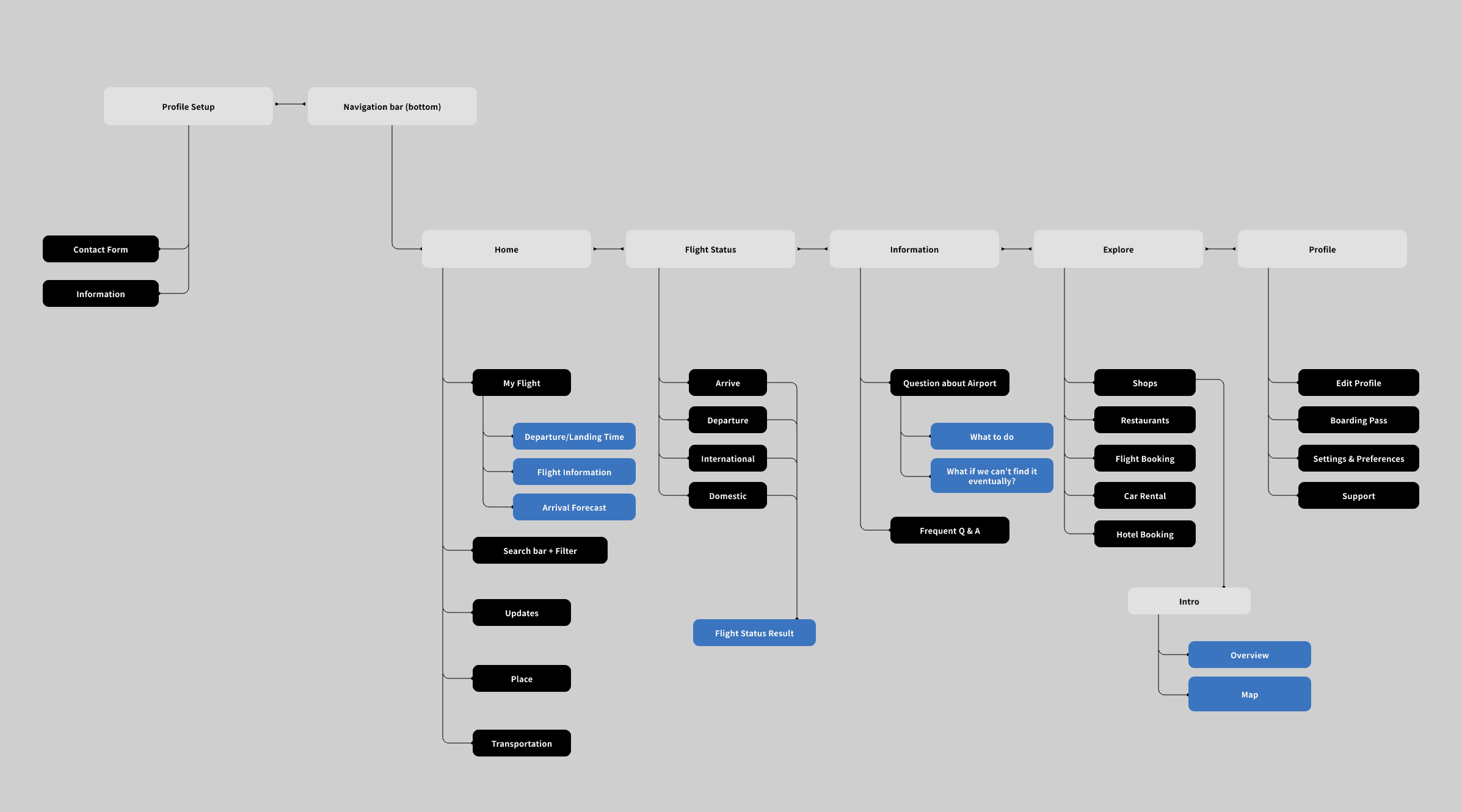
Information Architecture
Visualizing the high level journey helped determine which screens I needed to flesh out for my MVP while keeping in mind potential features.
Design
Information Architecture
Visualizing the high level journey helped determine which screens I needed to flesh out for my MVP while keeping in mind potential features.
This app is:
✅ Designed for seamless airport navigation, offering real-time flight updates, airport services, and essential travel info.
✅ Helps users track flights, explore amenities, and access transportation.
This app is not:
❌ A booking platform – It does not handle flight ticket purchases or airline reservations.
❌ A social travel app – It is not designed for trip planning, reviews, or social networking.
❌ A general city guide – While it helps with airport amenities, it does not provide full tourist itineraries or city exploration features.
Sketches
I plan to create 5 main navigations in my airport app, and I think sketching out my ideas and thoughts beforehand will be helpful in organizing them. This experiment will give me a better understanding of what I can improve from the sketches.

Sketches
I plan to create 5 main navigations in my airport app, and I think sketching out my ideas and thoughts beforehand will be helpful in organizing them. This experiment will give me a better understanding of what I can improve from the sketches.
Logo Design
✈ Airplane Symbol
Represents flight, speed, and seamless travel. It reflects the core purpose of the Airnav platform: helping users navigate airports efficiently.
🔷 Background
Symbolizes direction, precision, and navigation, reinforcing the idea of guiding travelers through real-time updates and smart travel solutions.
🎨 Color Choice
The blue background signifies trust, technology, and professionalism, while the green and orange accents create contrast, adding energy and innovation to the brand identity.

Design System
A design system is maintaining consistency across experiences. By using a set of standards, a design system ensures that every element conforms to the same look and feel, which is vital for creating a coherent brand identity and providing a seamless user experience.
Design System
A design system is maintaining consistency across experiences. By using a set of standards, a design system ensures that every element conforms to the same look and feel, which is vital for creating a coherent brand identity and providing a seamless user experience.

Interaction Design
AR navigation
Allowing users to navigate the airport using their smartphone camera
This feature eliminates confusion, especially in large and complex airport layouts, making navigation more intuitive and stress-free.
AI-powered assistant
To show the elegant style in the jewelry shop, we think that using a thin but sharp style - Aviano Didone will convey the desired sense of elegance and exclusivity.
Last but not least
Measuring KPI
User Engagement
Tracks active users, session duration, and app retention to assess usability and adoption.
Real-Time Accuracy
Measures how precise security wait-time estimates are compared to actual airport data (targeting ±5% variance)
Last but not least
Measuring KPI
User Engagement
Tracks active users, session duration, and app retention to assess usability and adoption.
Real-Time Accuracy
Measures how precise security wait-time estimates are compared to actual airport data (targeting ±5% variance)
Case Studies
Case Studies

OneBreathe
Mockup for the International Student
OneBreathe
Mockup for the International Student
Case Studies
OneBreathe
Mockup for the International Student
AIRNAV - Mockup for Airport app in Toronto Pearson
Timeline
Jan - May 2024
Rules
UX/UI Designer
UX Researcher
Skills
Interaction Design
Prototyping
Wireframe
Concepting
Tools
Figma
Miro
Overview
Every day, people travel from Toronto to destinations worldwide. Travelers both frequent and occasional remain unaware that Toronto Pearson Airport does not offer an advanced application to monitor flight schedules and airport services as well as other facilities. The project provides a chance to build AIRNAV which is an airport status application designed to enhance the travel experience.
This case study offers a thorough examination of the design process beginning with pain point identification and leading through solution development and comparative analysis while explaining decisions made at each stage.
What I Learn
🕶 Through user-centered design principles the team analyzed competitor apps and created a persona-based strategy that improved airport navigation for seamless user interactions.
🕶 The scalable logo design and intuitive user interface were crafted to merge aesthetic appeal with functional usability to boost user interaction.
💼 The team measured the app's effectiveness through established KPIs which included real-time accuracy and user engagement metrics.
💼 Tech Integration involved the exploration of AR-powered navigation systems along with AI-driven assistants to improve travel experience efficiency and quality.
What is this app?
🚀 "Airnav" is a combination of "Air" (aviation) and "Nav" (navigation), aims to be an user-focused travel companion, blending innovative design with functionality to cater to the diverse needs of frequent and occasional travelers. Centered on creating intuitive and efficient interactions, the app enhances the travel experience by providing real-time access to essential flight data and airport amenities in Toronto.
Researh
Identifying Problem
According to a Cisco AppDynamics survey (May 2022), 74% of travelers view apps and digital solutions as vital to their vacation experiences. Post-pandemic, travel app adoption surged, with summer 2022 downloads exceeding pre-pandemic peaks, as reported by data.ai.
However, many airports have discontinued their apps due to limited usage (failure to provide accurate updates and essential features), despite efforts to enhance passenger experiences through digital touchpoints. These apps largely failed to engage travelers effectively.
What is the solution?
Provide reliable, real-time updates on flight statuses, gate changes, and delays to build trust with users
Real-Time Accuracy
Provide reliable, real-time updates on flight statuses, gate changes, and delays to build trust with users
Real-Time Accuracy
Design a clean, intuitive interface for quick access to essential features like maps, boarding info, and check-ins.
Enhanced User Experience
Design a clean, intuitive interface for quick access to essential features like maps, boarding info, and check-ins.
Enhanced User Experience
Integrate functionalities like security wait times, baggage tracking, parking options, and lounge information.
Comprehensive Features
Integrate functionalities like security wait times, baggage tracking, parking options, and lounge information.
Comprehensive Features
Define
Competitor Analysis
Understanding different airport apps requires competitor analysis which aids in market gap identification and user expectation analysis while enabling feature differentiation and user experience optimization through insights from current strengths and weaknesses.
Glasgow Airport
Pros: Strong European connectivity, diverse passenger services, sustainability focus.
Cons: Congestion issues, limited advanced tech integration.
Glasgow Airport
Pros: Strong European connectivity, diverse passenger services, sustainability focus.
Cons: Congestion issues, limited advanced tech integration.
Auckland Airport
Pros: Largest NZ hub, modern facilities, strong tech use (facial recognition).
Cons: Capacity constraints, reliance on tourism traffic
Auckland Airport
Pros: Largest NZ hub, modern facilities, strong tech use (facial recognition).
Cons: Capacity constraints, reliance on tourism traffic
Miflight™
Pros: Real-time security wait times, global reach, user-friendly.
Cons: Relies on crowd-sourced data, lacks additional travel tools.
Miflight™
Pros: Real-time security wait times, global reach, user-friendly.
Cons: Relies on crowd-sourced data, lacks additional travel tools.
Target Audience
Creating a user persona to embody the ideal Visavis user based on the full research process I conducted, incorporating insights from the problem discovery, user surveys, competitor analysis, and major pain points. By synthesizing the gathered data, my aim is to represent the user's preferences, pain points, and behaviors, allowing for a more focused and effective redesign for our ideal user.
Design
Information Architecture
Visualizing the high level journey helped determine which screens I needed to flesh out for my MVP while keeping in mind potential features.
This app is:
✅ Designed for seamless airport navigation, offering real-time flight updates, airport services, and essential travel info.
✅ Helps users track flights, explore amenities, and access transportation.
This app is not:
❌ A booking platform – It does not handle flight ticket purchases or airline reservations.
❌ A social travel app – It is not designed for trip planning, reviews, or social networking.
❌ A general city guide – While it helps with airport amenities, it does not provide full tourist itineraries or city exploration features.
Sketches
I plan to create 5 main navigations in my airport app, and I think sketching out my ideas and thoughts beforehand will be helpful in organizing them. This experiment will give me a better understanding of what I can improve from the sketches.
Logo Design
✈ Airplane Symbol
Represents flight, speed, and seamless travel. It reflects the core purpose of the Airnav platform: helping users navigate airports efficiently.
🔷Backgro-und
Symbolizes direction, precision, and navigation, reinforcing the idea of guiding travelers through real-time updates and smart travel solutions.
🎨 Color Choice
The blue background signifies trust, technology, and professionalism, while the green and orange accents create contrast, adding energy and innovation to the brand identity.
Design System
A design system is maintaining consistency across experiences. By using a set of standards, a design system ensures that every element conforms to the same look and feel, which is vital for creating a coherent brand identity and providing a seamless user experience
Colour Decision
The color palette of gold, white, and black was chosen to reflect elegance and sophistication. Gold symbolizes luxury and quality, white conveys simplicity and purity.
Typography
To show the elegant style in the jewelry shop, we think that using a thin but sharp style - Aviano Didone will convey the desired sense of elegance and exclusivity.
Interaction Design
Last but not least
User Engagement
Tracks active users, session duration, and app retention to assess usability and adoption.
Real-Time Accuracy
Measures how precise security wait-time estimates are compared to actual airport data (targeting ±5% variance)
Case Studies
Case Studies
OneBreathe
Mockup for the International Student
OneBreathe
Mockup for the International Student